
Although charts are pretty simple, it may be a challenge to choose what type to use for analyzing the stock price. Before you add indicators and start looking for patterns, discover the basics of stock price charting.
Could you imagine that market rules were published in Confucian manuals to help predict price movements in the bustling markets of Imperial China? Such guides showed merchants how to determine market manipulations and understand the relationships between price and volume.
What is a price chart?
It doesn’t matter what asset you trade; a price chart is a fundamental tool that includes all the necessary information about its price movements. The information involves data on trading volumes and trends, as well as historical price data and current prices. There are several types of charts that can provide different information.
Stock chart: basic information
Above, you can see the standard stock price chart that will be opened as soon as you choose an asset on your broker’s trading platform. Most traders use Japanese candlesticks. Below, you will find more information about this type.
It’s a daily chart of PepsiCo shares. Therefore, each candlestick stands for price fluctuations within a day. On the right, you will find the axis with prices. As you can see, the current stock price is $172.15. On the bottom, there is an axis with time periods.
Vertical bars on the bottom represent the price volume and the number of stocks traded during the day. If the bars are higher, it means that the shares were traded more actively on those days. There is also a simple moving average on the price chart. You can apply any indicator you like. Most trading platforms allow traders to add even downloaded indicators.
In the upper left corner, you can see all the necessary information.
- Company name or ticker – depending on the platform, you will see either the company’s name or a ticker of shares you trade. The ticker is determined when the company goes public and places its shares on a particular stock exchange. It allows investors to find the stock quickly. Companies can’t have the same ticker on one stock exchange.
- Timeframe – 1D stands for the daily period. This means that each candlestick shows the price values within one trading day. There are numerous timeframes, from 1 second to 1 year. The most popular periods are 15-, 30-minute, hourly, 4-hour, daily, and weekly. The timeframe will depend on your trading strategy and style.
- Exchange – next, you will see the name of the exchange where the shares are listed. PepsiCo Inc. shares are traded on the NASDAQ. Remember that stocks can be listed on several exchanges.
- TradingView – it’s the platform the chart was taken from.
- O – as it’s the daily chart, O represents the opening stock price at the beginning of the trading day.
- H – it’s the highest price reached within the trading day.
- L – L is the lowest price that the price touched within the trading day.
- C – C stands for the closing price.
- Bid – the red rectangle stands for the bid price, which is the amount of capital a buyer is ready to pay for the stock.
- Ask – the blue rectangle shows the ask price, which is the minimum amount of capital a seller can take for the stock.
- Vol – vol is the amount of traded stocks for the day.
- MA – it’s the moving average indicator. The numbers reflect its settings. You can change them according to your trading strategy.
*Volume and moving average indicators can be removed from the chart.
There are several types of price charts. Below, you will find the major ones that can be used interchangeably to do a more comprehensive analysis of price movements.
1. Candlestick charts
Japanese candlesticks are the most popular and informative price chart.
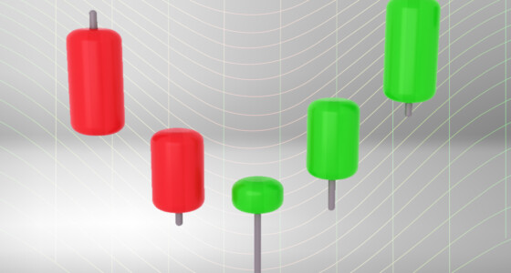
Each candle includes information on the open, close, high, and low prices for a certain time interval (timeframe). The body of the candlestick reflects opening and closing prices. The color of the body displays whether the closing price was above (the stock appreciated) or below (the stock value declined) the opening price. Usually, traders apply green or white colors for bullish candles and red or black for bearish ones. The highest price is represented by the upper wick (shadow). The lowest value is represented by the lower shadow.
There can be candles with no upper and lower shadows. If the bullish candle doesn’t have an upper shadow, this means that the closing price was the highest. If there is no lower wick, this means the opening price was the lowest within a certain period. As for the bearish candle, the lack of the upper shadow tells that the opening price was the highest for the period. If there is no lower shadow, it means that the closing price was the lowest value.
You can learn different types of candlesticks here.

2. Line charts
Although line charts aren’t as informative as candlestick ones, you will find them on authoritative financial websites, including Yahoo Finance and Nasdaq. The chart also includes the price and period axis.
You will find the same information as on the candlestick chart except for the lowest, highest, opening, and closing stock values. The chart reflects the current bid and ask prices.
This type of chart is widely used to determine long-term trends. Although you can apply it on different timeframes, it doesn’t show intraday ranges. Therefore, it’s ineffective for day traders.
Key technical elements
Applying various indicators and defining chart patterns, you can receive signals on entry and exit points. However, it will take time to learn how to use them. Being a newbie trader, you should begin with basic concepts.
1. Trend
A trend is a market condition in which the price moves in a certain direction for a prolonged period. If the price goes up for a while, it’s an up or bullish trend. If it declines, it’s a down or bearish trend. Trends can be found in any timeframe. However, more reliable trends are formed at bigger intervals. Traders should trade in the direction of the current trend. Therefore, open a long position when the price increases and a short position when it declines.
2. Support and resistance
Support and resistance are basic levels every trader should be able to identify.
Resistance is a boundary that prevents the price rise. The level is considered formed if the price touched it at least two times and declined after. It’s used to open sell positions.
Support is a boundary that doesn’t let the price fall. It’s used to open a buy trade, as the price is supposed to move up after it reaches this level.
You can also use support and resistance levels to trade breakouts. When the price is not stopped by the boundary, you can open a trade in the direction of a breakthrough.
Takeaway
It’s vital to read price charts because they reflect market sentiment, provide signals on the upcoming price direction, and keep historical price data. Although candlestick is the most popular chart type, you should learn how to use various charts, including Renko and Heiken Ashi.


