

A bar graph is a visualization that aids in illustrating the connection between different data points. For example, we can use it to demonstrate the relative importance of various issues or the relationships between multiple groups of individuals.
It’s crucial to understand the order of the data points while reading a bar graph. Typically, the top of the graph should contain the initial data point, and the other points should be arranged from bottom to top.
Earn profit in 1 minute
Understanding a Bar Graph
Bar graphs have two axes that are labeled and include a scale as well. The term “group data axis” refers to the axis marked at the bars’ base. Information regarding the type of data displayed is provided on this axis. The frequency data axis in a bar graph is the other axis. The frequency of the data is indicated by the range of values on this axis.
A bar graph’s bars are its most crucial component. These bars provide quick data comparison within a graph. For example, the reader can quickly compare the data to determine which measure appears more frequently and whether any data points have similar frequencies.
Effective strategies in your mailbox
Subscribe and discover a fund of trading knowledge
Great! Please check your email
We’ve sent you an email to confirm your subscription
Something went wrong
Try reloading the page. If that doesn’t help, please try again later
Bar Graph Properties
The following list includes some properties that set a bar graph apart from other types of graphs:
- Both horizontal and vertical representations of the bar graphs are possible.
- The bar’s width should be constant and evenly spaced.
- A title, label, and scale are required for each bar graph.
- The bar’s length reflects the value of the provided data.
- It must begin with zero frequency.
Bar Graph Types
There are two main categories of bar graphs: horizontal bar graphs and vertical bar graphs. These groups are broken into categories like stacked bar graphs, grouped bar graphs, and so on.
Trading with up to 90% profit
Horizontal Bar Graph

Bars of equal width, both vertically and horizontally, can be used to create bar graphs. In the case of the former, the value of that category is more relevant the higher the bar. However, the same approach is used concerning horizontal graphs, with the distinction that when measuring, the height is changed to length. They are typically helpful in cases with more than five categories and when a vertical graph cannot accurately depict the data.
Vertical Bar Graph
The most typical bar chart is a vertical bar graph, often called a column graph. Vertical bars with lengths proportionate to the numbers they represent are used to indicate the numerical value of the research variables.
Grouped Bar Graph
This bar graph enables you to visualize information about the various subgroups that make up the main group or category. The various sub-groups are defined by separate bars that are either patterned or color-coded to distinguish them from one another. A key or caption that describes each bar in a grouped bar graph and links it to the sub-groups is always present.
Stacked Bar Graph
A stacked bar graph resembles a grouped one in many ways. Nevertheless, the bars are piled on top rather than placed side by side (for vertical bars). The bars’ combined height represents the full value of the category. Additionally, each stacked component specifies how each sub-group contributes to the group as a whole.
How to start trading with $200 and minimum risk
Don’t let a small budget deter you from trading! Learn how to start trading with $100 or $200 and make the most out of this money!
Read more

Uses of Bar Graph
An incredible approach to visualizing data is via bar graphs. They can assist you in comprehending several facets of your data, including sales and marketing trends. Bar graphs are also a fantastic tool for comparing various goods and services. You can decide which good or service to seek next by employing the appropriate kind of bar graph.
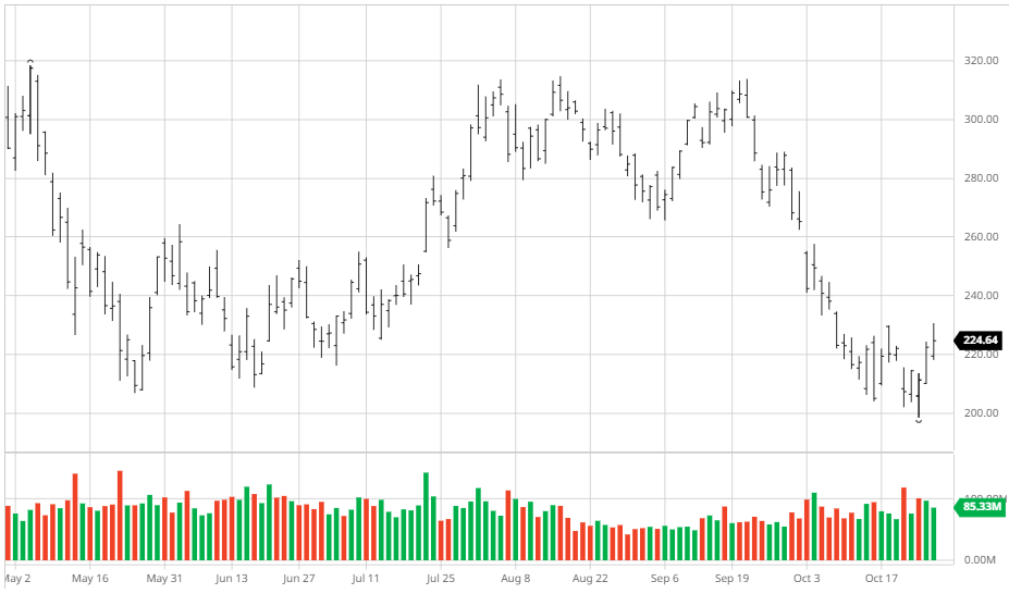
Example of Bar Graph
The moving average convergence divergence (MACD) histogram, a well-liked technical indicator that shows the distinction between the MACD line and the signal line, is used by many traders. An example of a Tesla, Inc. bar chart from the previous six months is shown below and was obtained from NASDAQ.
H2 – Bar Graph vs. Bar Chart
A bar graph is a way to display data by representing a set of bars that show the relative values. Each bar in the graph represents a category or value and is separated from other bars by a horizontal line.
A bar chart can be used as a simple visual representation of data. For example, it can show how much money the family spends in a year. We can also use a bar chart to compare different variables simultaneously, such as traffic volume over time.
Bar Graph vs. Histogram

A bar graph (also known as a column chart or simple bar chart) shows the number of items of a specific type in a group. It is useful for showing how many people are in a group, how many are male and female, or how many are married. In contrast, a histogram shows the number of occurrences of values on a graph. The bars on the graph show the frequency of individual values. Histograms can be used to compare two groups, for example, to see if there are more males or females in each group.
Histograms can also show the total number of occurrences of a value, for example, the number of times people have been seen with an illness. Generally, bar graphs are used to show counts, and histograms are used to show frequency. Bar graphs show single values, while histograms show multiple values at once, with their bars representing frequencies. Histograms can be especially useful when data has missing values or when you want to compare two groups that are different in size.
Bar Graph Limitations
A bar graph is a helpful way to display data in a simple, compact way. However, as with all forms of data visualization, several limits can make it a less-than-ideal choice for certain types of data. One of the main limitations of bar graphs is that their visual representation can make it challenging to compare data groups. Another limitation is that the width of a bar graph can only accommodate so much information at once.
As with any data visualization, You must carefully consider bar graphs before being used. Likewise, their limitations should be noted and understood before being used for any presentation. When used appropriately, however, a bar graph can be an effective way to present important data to an audience. By carefully designing and adjusting your chart’s layout and background colors, you can effectively communicate your message while staying within the limits of the chart’s format.
Bar Graph FAQs
What Are Some Benefits Of Bar Graph?
A bar graph is one of the essential tools for communicating quantitative data. For example, it’s often used to show the relative size of a group or to compare two different values. Visualizing a distribution is also easy since it shows how values are distributed across various categories.
There are a lot of benefits to using bar graphs. They’re simple and easy to understand, which makes them ideal for communicating complex data. They’re also great for showing the relative size of a group, which can be helpful in situations like brand tracking. They’re also easy to create and customize, so you can make them fit your data without worrying about formatting issues.
Why Are Bar Graphs Used?

Bar graphs are used to display data visually. A typical bar graph displays information about the number of customers, products, or visitors; the amount of money spent on various items; or the percentage of people who chose a particular product or service. You can also use bar graphs to compare two sets of data, such as comparing the number of employees at two different companies. When creating a bar graph, it is essential to ensure that the bars in the graph have equal lengths and heights. You can use bar graphs for a variety of purposes, including:
To show the number of customers by type (e.g., single vs. family), To show the number of products sold, To show how many visitors came to a website, To show how much money was spent on various items By comparing two sets of data.
What Are The Types Of Bar Graphs?
Bar graphs are one of the most common types of charts. They’re used to display numerical data, usually broken down into categories or ranges, often with a line or bar indicating a value. The bars can be vertical or horizontal. And they can be either filled (to show a high value) or empty (to show a low value). There are three main bar graphs: horizontal bar graphs, vertical bar graphs, and area graphs.
The Bottom Line
A bar graph is a simple way to display data. You can use it to display data in a simple, easy-to-read format. However, the type of graph you choose can affect how you interpret the data. The correct graph format can help you reflect your data clearly and concisely. Additionally, the right graph style can help you show your data in a visually appealing way. To ensure that your data is interpreted correctly, use tables and graphs to organize your information. By ensuring that all of your information is managed correctly, you will be able to understand the data better and make necessary decisions.
Start from $10, earn to $1000
<span>Like</span>